
The Color Edit: Valentine’s Edition
The Color Edit

Welcome to The Color Edit - a space dedicated to reimagining Eudaimonia Studio quilt patterns through the transformative power of color. With each edition, we’ll explore how a thoughtfully curated palette can completely shift the mood of a design…whether inspired by the seasons, a holiday, or simply a new creative perspective. Consider this an invitation to look at familiar patterns in an unfamiliar way - celebrating color, embracing creativity, and finding the confidence to experiment. Our hope is that these palettes spark fresh inspiration and encourage you to make each quilt uniquely your own!
Valentine’s Inspiration
This Valentine’s Day, I wanted to go beyond the classic reds and pinks and explore how color can tell a story! By mixing unexpected hues like soft blues, rich purples, and even hints of gold, this palette brings a fresh perspective to a familiar holiday.
The Color Palettes
Below, you’ll find a selection of Valentine’s Day inspired color palettes paired with some of our favorite quilt patterns! For each quilt, we’ve used Art Gallery Fabrics Pure Solids, but these palettes are just as inspiring for any fabric line you love. Since Eudaimonia Studio patterns are available in PreQuilt, you can experiment freely and play with color to your heart’s content!
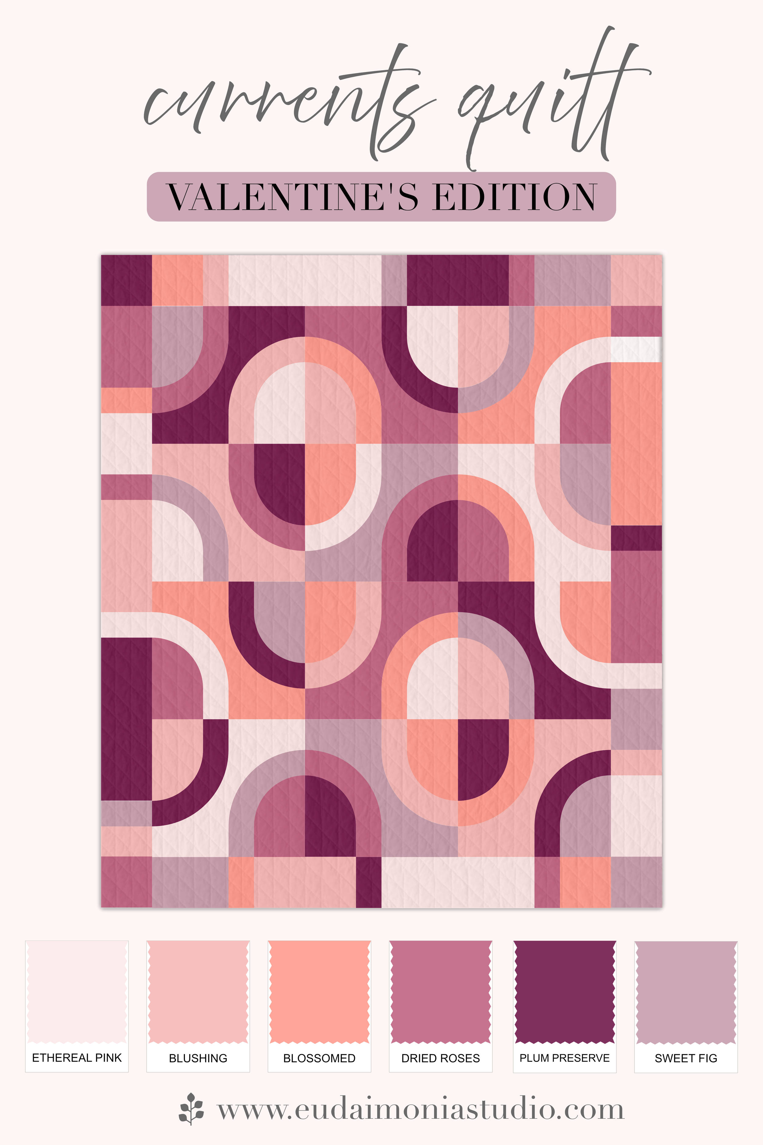
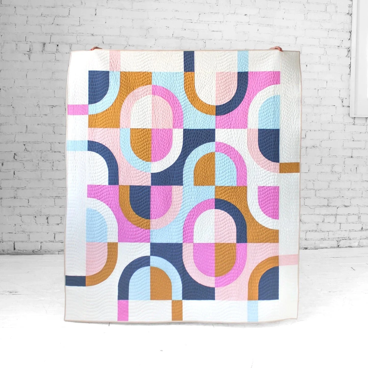
Rosy Outlook
Soft, dusty roses meet warm neutrals and gentle plum tones, in a palette that feels effortlessly romantic! We paired this color story with the Currents quilt, since the soft curves really seem to compliment these softer colors.
Fabrics (AGF Pure Solids):
Color 1: Ethereal Pink
Color 2: Blushing
Color 3: Blossomed
Color 4: Dried Roses
Color 5: Plum Preserve
Color 6: Sweet Fig
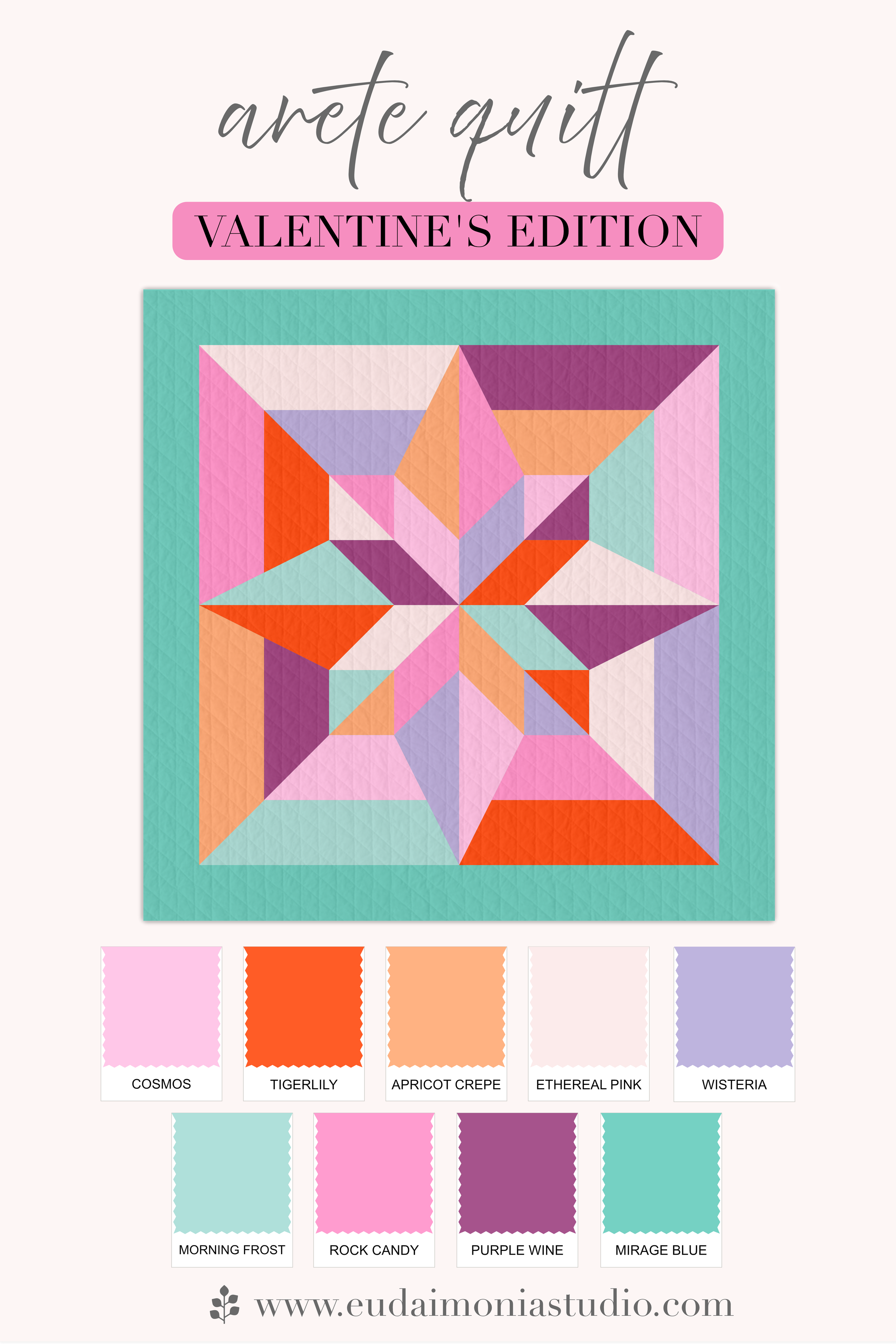
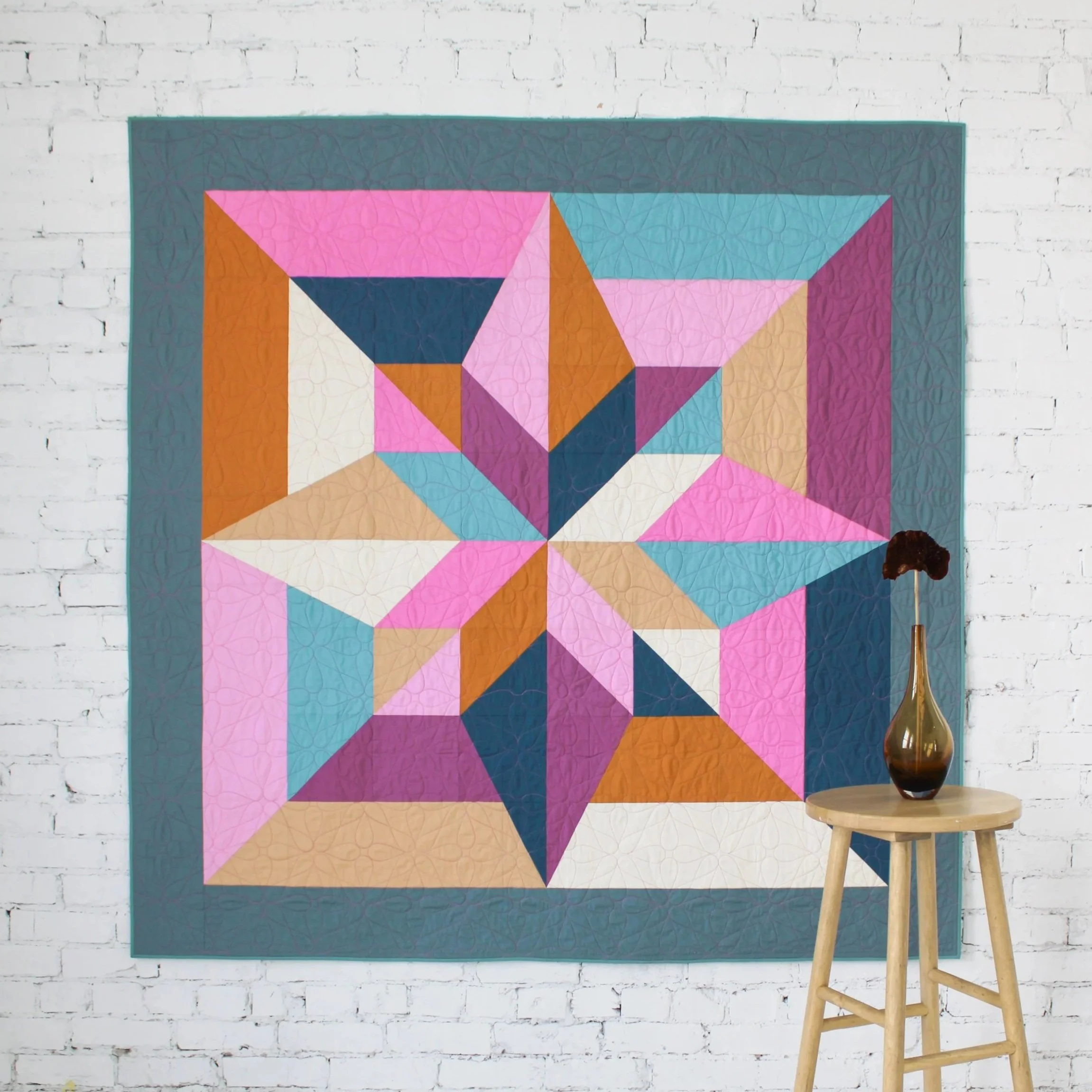
Candygram
Playful and full of charm, this palette takes its cue from classic conversation hearts with a fresh, modern twist! We loved how this color palette paired with the 8-Color Arete quilt to feature bold blocks of color that really made the colors stand out!
Fabrics (AGF Pure Solids):
Color 1: Cosmos
Color 2: Tigerlily
Color 3: Apricot Crepe
Color 4: Ethereal Pink
Color 5: Wisteria
Color 6: Morning Frost
Color 7: Rock Candy
Color 8: Purple Wine
Border: Mirage Blue
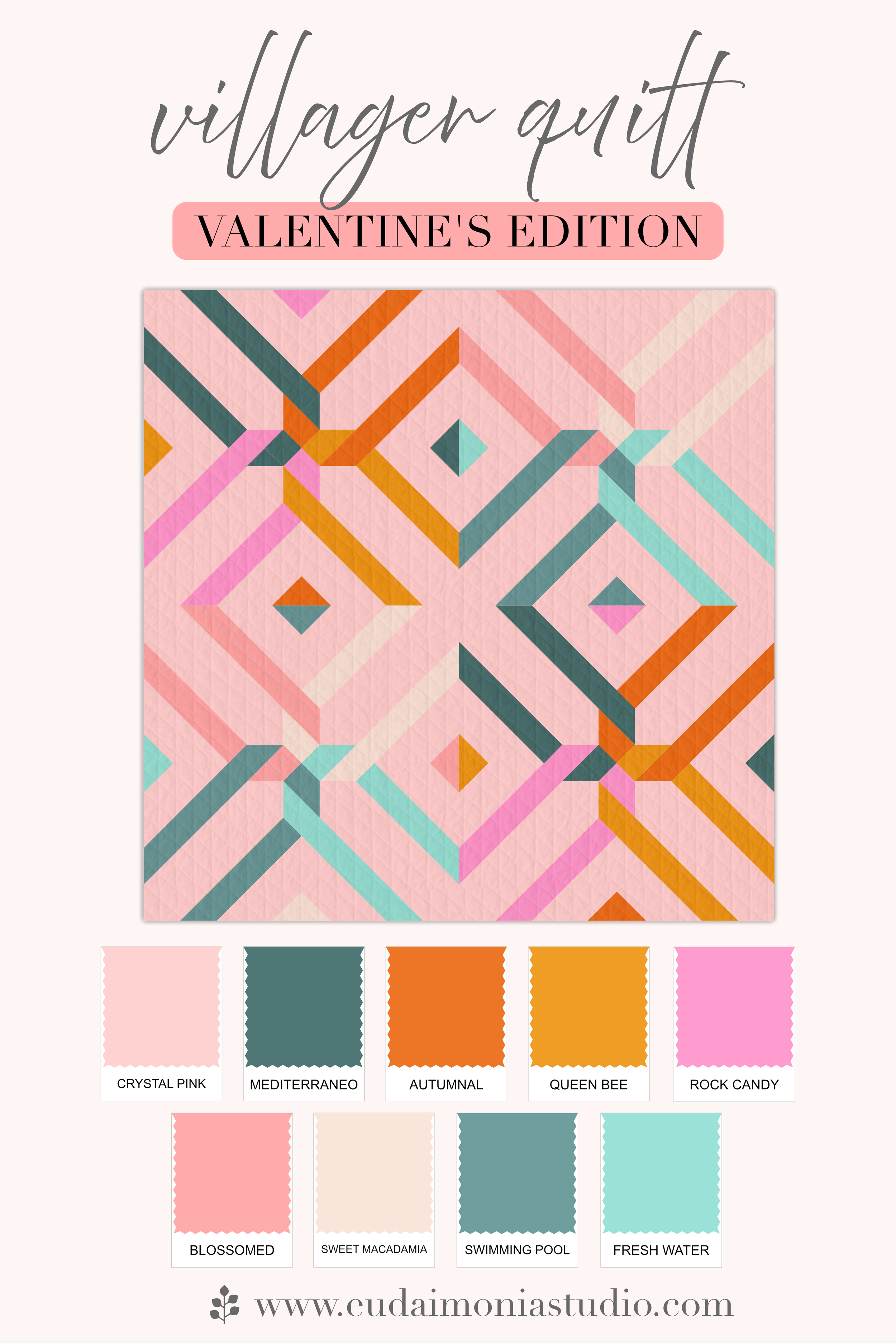
Better Together
Bright, cheerful, and full of personality, this palette celebrates the magic that happens when colors - and people - come together. The scrappy version of teh Villager quilt pairs naturally with this palette that reflects connection and shared purpose.
Fabrics (AGF Pure Solids):
Background: Crystal Pink
Color 1a: Queen Bee
Color 2a: Mediterraneo
Color 3a: Rock Candy
Color 4a: Autumnal
Color 1b: Fresh Water
Color 2b: Blossomed
Color 3b: Swimming Pool
Color 4b: Sweet Macadamia
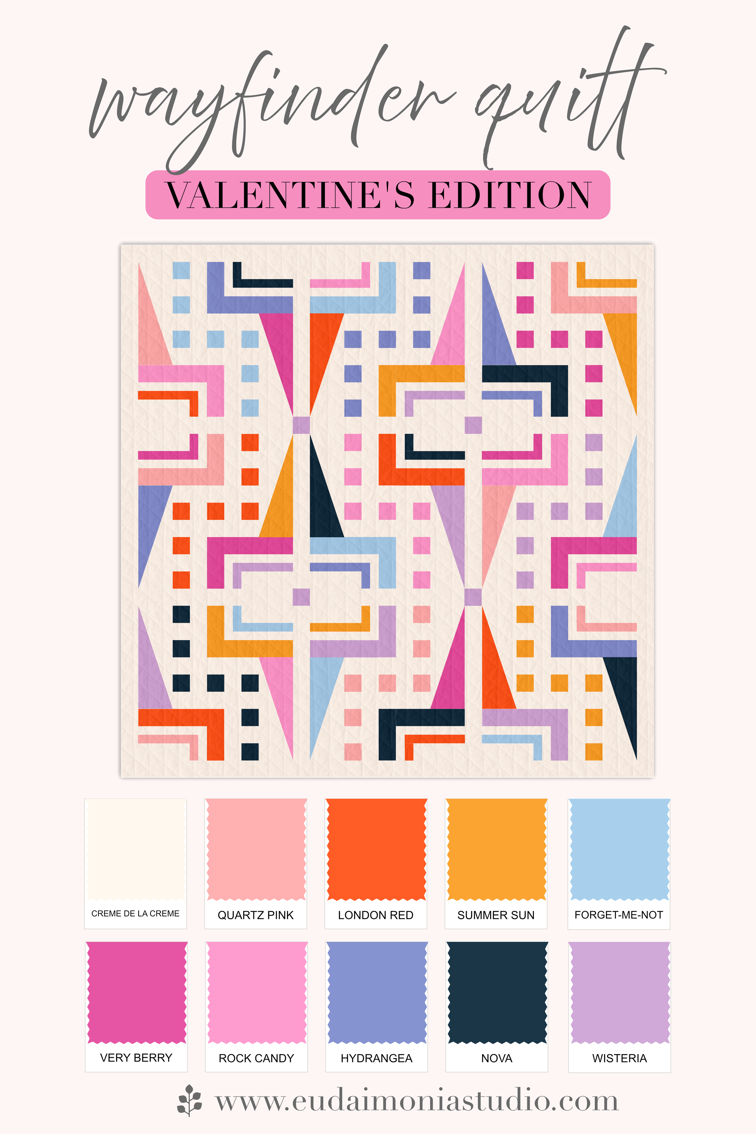
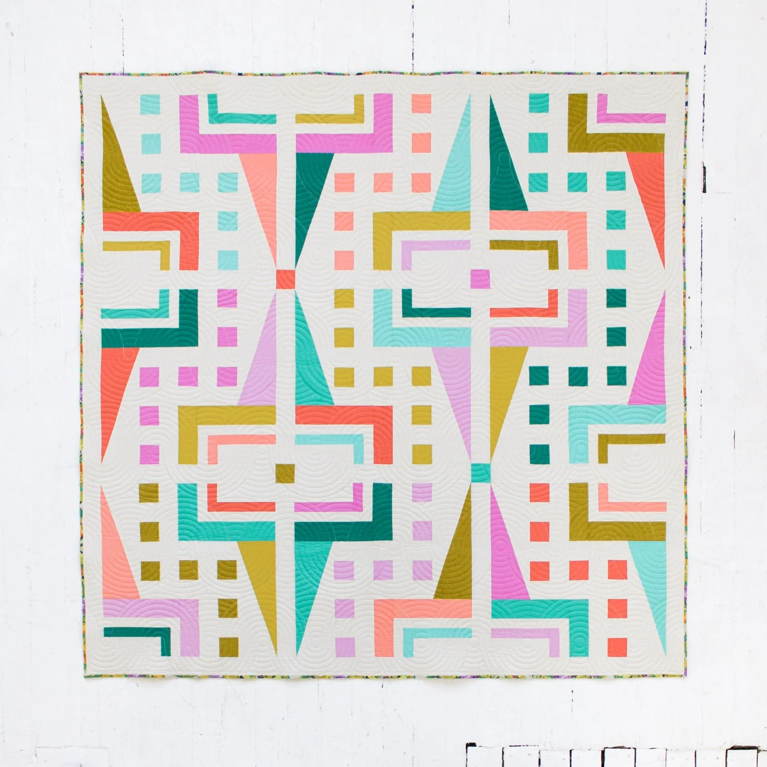
Be Mine
Valentine’s… but with a twist! This palette mixes classic pinks, reds, and purples with unexpected pops of blue and gold. The scrappy version of the Wayfinder quilt was the perfect showcase - 10 colors coming together seamlessly to prove how a bold, varied palette can create a beautifully cohesive design.
Fabrics (AGF Pure Solids):
Color 1 (Bkgd): Creme de la Creme
Non-Bkgd 1: Quartz Pink
Non-Bkgd 2: London Red
Non-Bkgd 3: Summer Sun
Non-Bkgd 4: Forget-Me-Not
Non-Bkgd 5: Very Berry
Non-Bkgd 6: Rock Candy
Non-Bkgd 7: Hydrangea
Non-Bkgd 8: Nova
Non-Bkgd 9: Wisteria
Ready to bring these color palettes to life? Click below to grab the patterns and start quilting your own vibrant Valentine’s designs!
Use code CQBUNDLE at checkout to save $10 when you buy the Currents Quilt pattern & workshop together!
Join me January 25, 2025 at Road to California for an in-person Currents quilt workshop!
About the design.
The Currents design abstractly represents the concept of wu wei - a central principle in Chinese and especially Daoist philosophy. The term literally translates to “non-doing.” While a common misconception, it is not about inaction; rather, it suggests we not resist forces outside of our control, and instead mindfully - and less effortlessly - respond by harnessing these winds & currents to advance our proverbial boat.
This fun, undulating design is a great introduction to curves with its large, forgiving blocks. Play around with color placement, and explore the many variations of this fun - and surprisingly quick! - quilt pattern.
Get the companion on-demand workshop.
For extra guidance & confidence, add the Currents Quilt Workshop. In this companion on-demand course, you can sew along with Brooke at your own pace with 20+ videos of demonstrations, guidance & all the helpful tips you'd get in a live workshop - from fabric selection considerations to final quilting design suggestions. Access to your workshop never expires, so watch the videos as often as you like, or whenever you need a refresher. Post in the Thinkific course platform to get help if you get stuck.
Note: The companion workshop is a supplement to - not a replacement for - the Currents quilt pattern. The pattern includes templates, cutting measurements & diagrams, and other instructions required for successful completion of your Currents quilt top.
More about the Currents quilt pattern.
Skill Level: Advanced Beginner / Intermediate
Instructions for Baby, Throw, Twin, Queen & King sizes included
Instructions for two main color variations - Two-Tone & Six-Color - with three border options for the Six-Color in Throw size;
Love scrappy quilts? See the "off-pattern" Fat Quarter Currents Quilt blog post
Currents quilt acrylic templates (sold separately) make tracing/cutting your pieces a breeze
Cutting diagrams help with efficient cutting and get you sewing sooner, with labels to help keep you organized
Coloring sheet to help get you started, with sample mockups for inspiration; plus, plan your quilt on PreQuilt & QuiltInk!
Downloadable PDF
Pattern licensing for online shops.
For online shops interested in selling this PDF pattern, please see the Pattern Licensing Page for more information.
Materials & maker credits.
All fabrics in the quilts pictured are Art Gallery Fabrics. Kits for certain pictured versions are available from: Global Fiber, Lamb & Loom, Gotham Quilts, Pear Tree Market & Cottoneer
Included are samples made by Mandy Plummer (@handmademandy) & Amanda Eastmond (@seamrip_seamstress)
Longarming by Trace Creek Quilting & Wild Phil Quilting. Pantographs used include: Paradoxical by Jess Zeigler, Wavy Lines, Baptist Sunrise by Katie Hanson, Sunrise Skateland by Julie Hirt, and 6-Petal Flowers by Deborah Lobban.
Complete the bundle with the Arete 4-Color quilt pattern for just $6 more (both patterns for $20)! Discount taken at checkout.
Use code HRTBUNDLE at checkout to save $10 when you buy the Arete quilt pattern and the Mastering HRTs workshop together! (cannot be combined with pattern bundle discount)
Kits for sample versions are available from Global Fiber, Pear Tree Market, and Cottoneer Fabrics. Additional kits are available from Going Coastal Fabrics.
About the design.
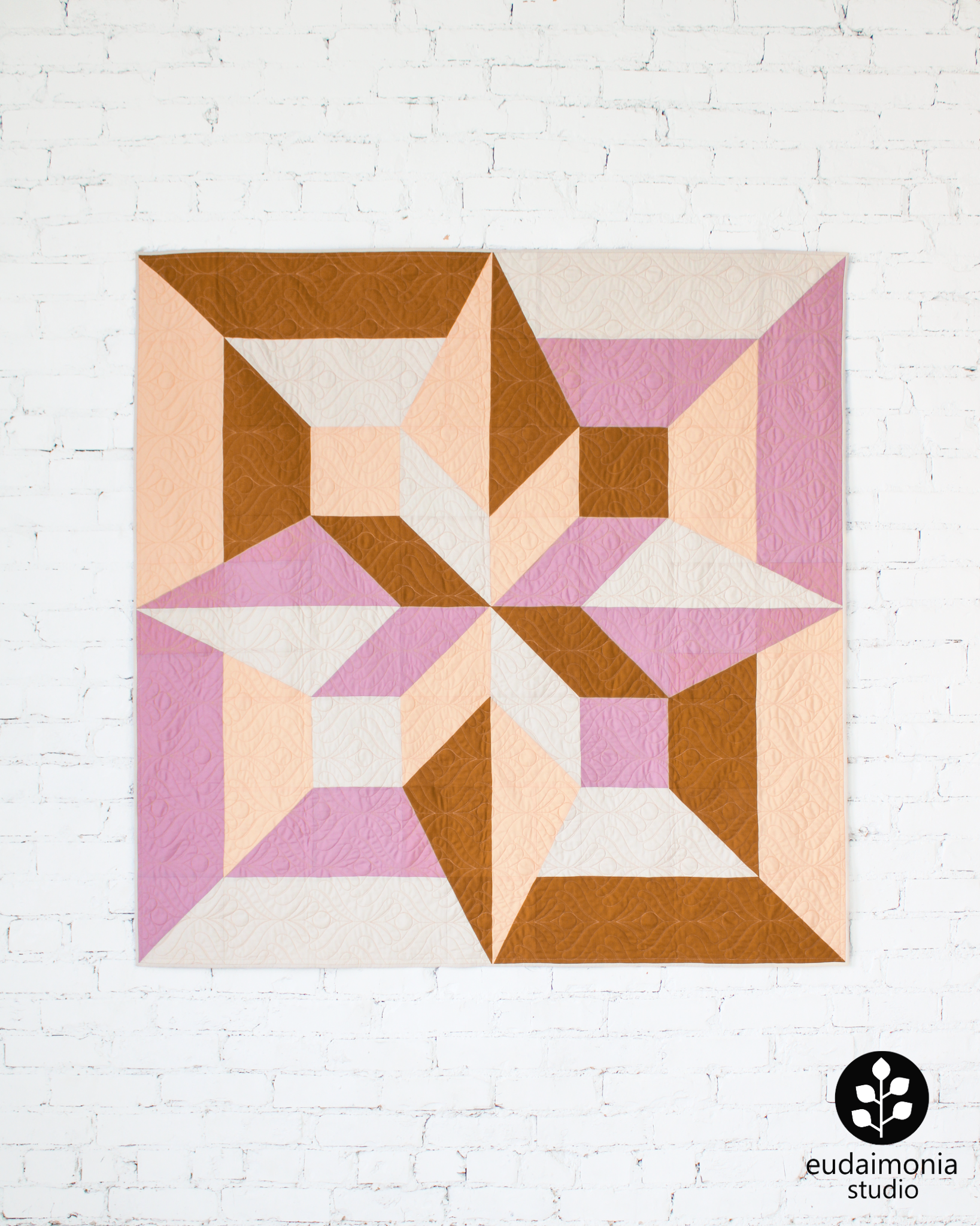
The Arete quilt is inspired by Aristotle’s concept “excellence,” representing the continuous pursuit of one’s highest potential in all aspects of life—intellectual, moral, physical, and creative. To live with arete is to align every effort with a deeper why, transforming our multidimensional lives into an overarching life purpose and more meaningful existence.
This bold, large-scale design is a quick project using traditional piecing—without the Y seams! Using only squares, rectangles, half-square triangles and half-rectangle triangles, you can stitch up your own multidimensional star design that is sure to make a statement.
Learn more about the Arete samples pictured.
New to HRTs? Get the Mastering HRTs on-demand workshop.
For extra guidance & confidence with half-rectangle triangles, add the Mastering HRTs Workshop. In this on-demand course, Brooke will pull the curtain back to demystify HRTs, going deep on what makes this unit unique, different methods for making HRTs, tips for accurate trimming, and even how to make your own HRT templates of any size. Access to your workshop never expires, so watch the videos as often as you like, or whenever you need a refresher. Post in the Thinkific course platform to get help if you get stuck.
More about the Arete quilt pattern.
Skill Level: Confident Beginner
Instructions for Pillow, Baby, Throw & King sizes included; optional border allows you more flexibility with Baby and Throw quilt sizes\
Printable templates included; acrylic templates (sold separately by Cut Once Quilts) make tracing/cutting your pieces a breeze
Cutting diagrams help with efficient cutting and get you sewing sooner, with labels to help keep you organized
Coloring sheet to help get you started, with sample mockups for inspiration; plus, plan your quilt on PreQuilt!
Downloadable PDF
Materials & maker credits.
Samples pieced by Chelsea LeBouton, Meagan Walker, and Brooke Shankland. All fabrics in the quilts pictured are Art Gallery Fabrics. See details on each sample pictured in the Arete Studio Notes.
Longarming by Sarah Sass of Sassy Quilting and Trace Creek Quilting. Pantographs used include: Meditation by The Quilting Mill, Sashiko by Karen Thompson, and So Chic Blooms by Crystal Smythe.

The Villager quilt is inspired by the importance of coming together to lend a helping hand, and of being able to lean on one another. The design reflects how “villagers” link arms and surround their community members in times of need. It is a call to remember our shared humanity and responsibility to care for our fellow villagers, in ways both big and small.
This versatile design, while looking complex, has simple, standard construction and is a quick sew.
10% of all sales of the Villager pattern through 9/24/23 will be donated to UNICEF to provide shelter, safe water, medical care, protection & psychosocial support to children and families affected by the earthquake in Morocco.
More about the Villager pattern:
Skill Level: Advanced Beginner to Intermediate, and difficulty depends on which variation you are making. While only basic quilting skills are required for any variation, each involves its own level of organization and attention paid to ensure color placement is accurate. From easiest to hardest is: Two-Tone, Standard, then Scrappy.
Tips provided for handling blocks’ bias edges
Instructions for Wall, Baby, Throw, Twin, Queen & King sizes included
Instructions for three variations: Two-Tone, Standard & Scrappy (fat quarter friendly)
Yardage width-of-fabric & fat quarter cutting diagrams help with efficient cutting and get you sewing sooner, with labels to help keep you organized
Coloring sheet to help get you started, with sample mockups for inspiration
Downloadable PDF
Interested in kits? Find them at the following shops:
Lamb & Loom: Duval & Suzy Quilts Solids
For online shops interested in selling this PDF pattern, please see the Pattern Licensing Page for more information.
Maker credit:
Longarm quilting by Wild Phil Quilting
All fabrics in the quilts pictured are by Art Gallery Fabrics
The Wayfinder quilt represents the idea that, in a broad sense, we never really “arrive”; we are always navigating and re-orienting ourselves toward new directions. With this in mind, the design seeks to remind us to live in and appreciate each point on this long, winding path - not just the destination.
More about the Wayfinder pattern:
Skill Level: Advanced Beginner - This pattern involves a scant 1/4” seam as well as half rectangle triangles (HRTs) made using templates; explicit instructions are included so that any HRT first-timer can create with ease
Printable templates included
Instructions for Mini, Baby, Throw, Twin, Queen & King sizes included
Instructions for a Five-Color variation + three different fat quarter friendly Scrappy variations
Instructions for two different block layouts for completely different looks
Yardage width-of-fabric & fat quarter cutting diagrams help with efficient cutting and get you sewing sooner
Coloring sheet to help get you started, with sample mockups for inspiration
Downloadable PDF
Learn more about the fabrics, quilting design, and tools used in each sample pictured.
Interested in kits? Find them at Lamb & Loom!
For online shops interested in selling this PDF pattern, please see the Pattern Licensing Page for more information.
Maker credit:
Longarm quilting by Wild Phil Quilting
All fabrics in the quilts pictured are by Art Gallery Fabrics